BlazoriseUI Components
A collection of Blazor components based on Blazorise, including a draggable tree component, enhanced DataGrid, and more.
Installation
This project depends on the
Volo.Abp.BlazoriseUIproject. By installing this project, you get all the functionality of Volo.Abp.BlazoriseUI.
In an ABP project, you can use these components by installing the Dignite.Abp.BlazoriseUI NuGet package. Additionally, add [DependsOn(typeof(DigniteAbpBlazoriseUiModule))] to the dependency list of your ABP module.
AutoHeight Component
The <AutoHeight> component generates a <div> element that, starting from where it is inserted, calculates the height of the <div> to fill the remaining screen height based on the current viewport height.
If the content within the <AutoHeight> component exceeds its height, a scrollbar will appear.
Basic Usage
<AutoHeight>
    <div>This is an inner element.</div>
</AutoHeight>
AutoHeight with ExtraHeight
Set the ExtraHeight value for the <AutoHeight> component, and the height of the <AutoHeight> component will be reduced by the specified ExtraHeight pixels.
<AutoHeight ExtraHeight="45">
    <div>This is an inner element.</div>
</AutoHeight>
ExtensibleDataGrid Component
The ExtensibleDataGrid component simplifies the usage of the [Blazorise DataGrid](https://blazorise.com/docs/extensions/datagrid/getting-started) component while adding new features like adaptive height and programmable TableColumn.
ExtensibleDataGridis typically used with[AbpCrudPageBase](https://github.com/abpframework/abp/blob/dev/framework/src/Volo.Abp.BlazoriseUI/AbpCrudPageBase.cs).
Basic Usage
@inject ISiteAdminAppService SiteAdminAppService
@inherits AbpCrudPageBase<ISectionAdminAppService, SectionDto, Guid, GetSectionsInput, CreateSectionInput, UpdateSectionInput>
<ExtensibleDataGrid TItem="SectionDto"
                    Data="@Entities"
                    ReadData="@OnDataGridReadAsync"
                    TotalItems="@TotalCount"
                    ShowPager="true"
                    PageSize="@PageSize"
                    CurrentPage="@CurrentPage"
                    Columns="@SectionManagementTableColumns">
</ExtensibleDataGrid>
public partial class SectionManagement
{
    protected List<TableColumn> SectionManagementTableColumns => TableColumns.Get<SectionManagement>();

    protected override ValueTask SetTableColumnsAsync()
    {
        SectionManagementTableColumns
            .AddRange(new TableColumn[]
            {
                new TableColumn
                {
                    Title = L["DisplayName"],
                    Data = nameof(SectionDto.DisplayName)
                },
                new TableColumn
                {
                    Title = L["Name"],
                    Data = nameof(SectionDto.Name)
                },
                new TableColumn
                {
                    Title = L["Route"],
                    Data = nameof(SectionDto.Route)
                },
                new TableColumn
                {
                    Title = L["Template"],
                    Sortable = true,
                    Data = nameof(SectionDto.Template)
                }
            });

        return base.SetTableColumnsAsync();
    }
}
SelectionMode
SelectionMode supports two modes: Multiple?DataGridSelectionMode.Single and Multiple?DataGridSelectionMode.Multiple, with the default value being Multiple?DataGridSelectionMode.Single.
If you set SelectionMode to Multiple?DataGridSelectionMode.Multiple, checkboxes will appear in front of each row.
To get the selected records:
<ExtensibleDataGrid TItem="SectionDto" @ref="DataGridRef"
                    SelectionMode="Multiple?DataGridSelectionMode.Multiple: DataGridSelectionMode.Single"
                    Data="Entities"
                    ReadData="OnDataGridReadAsync"
                    TotalItems="TotalCount"
                    ShowPager="true"
                    PageSize="PageSize"
                    CurrentPage="@CurrentPage"
                    Columns="@SectionManagementTableColumns">
</ExtensibleDataGrid>
<Button Color="Color.Primary" Clicked="SelectSectionsAsync">Select Records</Button>
public partial class SectionManagement
{
    protected virtual async Task SelectSectionsAsync()
    {
        var items = DataGridRef.SelectedItems;
    }
}
API
Here are all the properties of the ExtensibleDataGrid component:
TItem: Specifies the data type.Data: Specifies the list of data of typeTItem.ReadData: Asynchronously reads the list of data. If your page inherits fromAbpCrudPageBase, you can directly use theOnDataGridReadAsyncmethod.TotalItems: Specifies the total number of data items.ShowPager: Specifies whether to display pagination navigation.CurrentPage: Specifies the current page in data pagination.Columns: Specifies the list of[TableColumn](https://github.com/abpframework/abp/blob/dev/framework/src/Volo.Abp.AspNetCore.Components.Web/Volo/Abp/AspNetCore/Components/Web/Extensibility/TableColumns/TableColumn.cs).SelectionMode: Specifies how data is selected, supportingMultiple?DataGridSelectionMode.SingleandMultiple?DataGridSelectionMode.Multiple. The default value isMultiple?DataGridSelectionMode.Single.ExtraHeight: Specifies additional height for theExtensibleDataGridcomponent, allowing developers to control its adaptive height.
PasswordEdit Component
The PasswordEdit component is a wrapper for <TextEdit Role="TextRole.Password"></TextEdit>, adding the ability to toggle between displaying the password in plain text and generating a new random password.

Basic Usage
<PasswordEdit @bind-Password="NewPassword"></PasswordEdit>
API
Here are all the properties of the PasswordEdit component:
Password: Gets or sets the password within the input box.PasswordChanged: Event callback that triggers when the password is changed.Length: Sets the length of the randomly generated password (default value: 6).Characters: Sets the character set for the randomly generated password (default value:ABCDEFGHIJKLMNOPQRSTUVWXYZabcdefghijklmnopqrstuvwxyz_-{}[]!@#$%^&*();'=+<>,.|?0123456789).Validator: Validation handler for validating the selected value.AsyncValidator: Asynchronous validation handler for validating the selected value.
ExtensibleTreeView Component
The ExtensibleTreeView component is a wrapper for the [Blazorise TreeView](https://blazorise.com/docs/extensions/treeview) component, preserving its original functionality while adding drag-and-drop capabilities.
Basic Usage
<ExtensibleTreeView TNode="Item" Nodes="Items" Draggable
          GetChildNodes="@(item => item.Children)"
          HasChildNodes="@(item => item.Children?.Any() == true)"
          @bind-SelectedNode="selected

Node"
          @bind-ExpandedNodes="expandedNodes"
          NodeDropped="@OnDropped">
    <NodeContent>
        <Icon Name="IconName.Folder" />
        @context.Text
    </NodeContent>
</ExtensibleTreeView>
@code{
    public class Item
    {
        public string Text { get; set; }
        public IEnumerable<Item> Children { get; set; }
    }

    IEnumerable<Item> Items = new[]
    {
        new Item { Text = "Item 1" },
        new Item
        {
            Text = "Item 2",
            Children = new []
            {
                new Item { Text = "Item 2.1" },
                new Item
                {
                    Text = "Item 2.2",
                    Children = new []
                    {
                        new Item { Text = "Item 2.2.1" },
                        new Item { Text = "Item 2.2.2" },
                        new Item { Text = "Item 2.2.3" },
                        new Item { Text = "Item 2.2.4" }
                    }
                },
                new Item { Text = "Item 2.3" },
                new Item { Text = "Item 2.4" }
            }
        },
        new Item { Text = "Item 3" },
    };

    IList<Item> expandedNodes = new List<Item>();
    Item selectedNode;

    protected virtual async void OnDropped(DropNode<Item> dropNode)
    {
        if (dropNode.Node.Id == dropNode.Target.Id)
            return;

        if(dropNode.Area==DragEnterNodePosition.Inside)
        {
            // Drag and drop inside the target node
        }
        else if (position == DragEnterNodePosition.Bottom)
        {
            // Drag and drop below the target node
        }

        await this.InvokeAsync(() => this.StateHasChanged());
    }
}
API
Here are all the properties of the ExtensibleTreeView component:
Nodes: Binds to the list of nodes for the component.NodeContent: Template for displaying the node content.SelectedNode: Specifies the currently selected node.SelectedNodeChanged: Event callback triggered when a node is selected.ExpandedNodes: Specifies the list of currently expanded child nodes.ExpandedNodesChanged: Event callback triggered when the expanded nodes collection changes.ClearNode: Event callback triggered when a selected node is cleared.GetChildNodes: Specifies the method to get the list of child nodes for a node.HasChildNodes: Specifies the method to determine whether a node has child elements.Draggable: Enables or disables drag-and-drop functionality (default value: false).NodeDropped: Event callback triggered when a node is dragged and dropped.
TreeSelect Component
The TreeSelect component is a dropdown tree-select component.
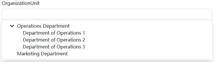
Basic Usage
<TreeSelect TNode="Item" TValue="string"
            Nodes="@Items"
            SelectedNodeChanged="OnSelectNodeChanged"
            GetChildNodes="@(item => item.Children)"
            HasChildNodes="@(item => item.Children?.Any() == true)"
            NodeText="x=>x.Text">
</TreeSelect>
@code{
    public class Item
    {
        public string Text { get; set; }
        public IEnumerable<Item> Children { get; set; }
    }

    IEnumerable<Item> Items = new[]
    {
        new Item { Text = "Item 1" },
        new Item
        {
            Text = "Item 2",
            Children = new []
            {
                new Item { Text = "Item 2.1" },
                new Item
                {
                    Text = "Item 2.2",
                    Children = new []
                    {
                        new Item { Text = "Item 2.2.1" },
                        new Item { Text = "Item 2.2.2" },
                        new Item { Text = "Item 2.2.3" },
                        new Item { Text = "Item 2.2.4" }
                    }
                },
                new Item { Text = "Item 2.3" },
                new Item { Text = "Item 2.4" }
            }
        },
        new Item { Text = "Item 3" },
    };

    protected virtual Task OnSelectNodeChanged(Item args)
    {
        Console.WriteLine(args.Text);
        return Task.CompletedTask;
    }
}
API
Here are all the properties of the TreeSelect component:
Nodes: Binds to the list of nodes for the component.SelectedNode: Specifies the currently selected node.SelectedNodeChanged: Event callback triggered when a node is selected.ExpandedNodes: Specifies the list of currently expanded child nodes.ExpandedNodesChanged: Event callback triggered when the expanded nodes collection changes.ClearNode: Event callback triggered when a selected node is cleared.GetChildNodes: Specifies the method to get the list of child nodes for a node.HasChildNodes: Specifies the method to determine whether a node has child elements.NodeText: Specifies the delegate for displaying node text.Validator: Validation handler for validating the selected value.AsyncValidator: Asynchronous validation handler for validating the selected value.